
Scatter Plots - Data Selection
To access this screen:
-
Open the Scatter Plots screen, select the Data Selection tab (shown by default).
The Data Selection tab is used to define the scatter plot data source, axes types and layout parameters.
To configure these settings:
-
In the Files and Fields group, configure the data source controls:
-
Select Loaded Data, then choose an item from the drop-down list to use an object currently loaded in memory.
-
Select Data File, then use the browse button to select a Datamine file on your local or network system.
-
-
Click
 to browse for a Datamine file that has been added to the project. This opens the Project Browser screen.
 -
Click
 to refresh or reload the data file.
-
Select a data column for each of the X Axis and Y Axis fields.
-
Optionally select one or more Key Field values. All fields, both alphanumeric and numeric, in the selected dataset are listed in the Key Fields column. Up to 5 fields may be selected. Multiple selections or de-selections can be made using the cursor and <Ctrl> key. Selecting a key field creates a separate data range, and if Multiple Charts is selected, a separate chart, for each different value within that field or combination of fields.
-
-
In the Normal/Log group, configure the X and Y data and axis scale types:
-
Select Normal - Normal to display both X and Y axes with normal data values and scales, i.e. not logged.
-
Select Normal - Log to use normal X axis data and scale, and logged Y axis data and scale.
-
Select Log - Normal to use logged X axis data and scale, and normal Y axis data and scale.
-
Select Log - Log to display both X and Y axes with log data and scales.
-
-
In the Layout group, configure the layout controls:
-
Select Multiple Charts to generate a separate chart for each data set defined by the selections made in the Files and Fields section above. Where key fields are not selected, only one chart is generated; if a key field has been selected, a subset data series is generated for each unique value within that field. Where multiple key fields have been selected, a chart series is generated for every combination of unique key field values.
If Multiple Charts is selected, each chart is listed independently on the Charts tab. Each chart has its own thumbnail and can be displayed individually in the Preview Area.
The chart's properties can be edited to facilitate the display of these multiple charts in a tabular arrangement. See Chart Properties.
-
-
Select Compound Chart to generate a chart that contains more than one individual chart. Compound charts are constructed from the same chart-generation rules as their multiple chart equivalents, but only one chart is created.
-
Check Delete Empty Charts to delete any scatter plot charts that have no data points. This option is checked by default.
-
Review the Summary section to see the main parameters used to create the scatter plot chart.
-
Maximum number of charts: based on the selections made above, this information denotes the number of individual charts that will be created; each chart has its own thumbnail in the Preview Area.
-
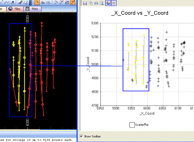
XY Axes or Coordinates?
The scatter plot X and Y axes can be used to represent non spatial as well as spatial data. For example, the following montage shows a plan view of static drillhole data, with several drillholes highlighted in the Design window; note how the corresponding points that are highlighted in the Scatter Plot screen correlate to the physical positions of sample positions (connecting lines in the scatter plot view are drawn for demonstration purposes only):
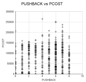
A more common use of the scatter plot, however, would be to compare one numeric data field with another with each field represented by either the X or Y axis. For example, the following scatter plot was generated according to data held in a block model data file processed by Datamine's NPV Scheduler application. The production cost was set as the Y axis and the X axis was set to the pushback number. The result shows, on a cell-by-cell basis, that the production costs increase for each pushback number:
To use the Data Selection tab:
-
After opening the Scatter Plots screen for either a new or existing scatter plot chart, select the Data Selection tab.
-
In the Files and Fields group choose whether to base the scatter plot on Loaded Data (that is, data already in memory) or values held in a physical Data File.
-
For Loaded Data: use the drop-down list to select from the objects currently loaded into memory.
-
For a Data File, use the browse button to select the desired file on the local system or network.
-
-
Select one X and one Y value (multiple selections are not permitted) from each of the respective lists.
-
Optionally select one or more key fields if you want multiple charts (or a compound chart) to display a data range for every unique key field value or combination of values.
-
Select Apply or OK to update the preview area and the plot item or sheet within the Plots window.
Related topics and activities: