
Create a Pivot Chart
Once you have created a pivot table view and produced pivoted results, you can display a chart of results.
This can be useful to visualize results. For example, you want to show a histogram indicating total cost of operations for a particular design type, for 10 successive months, the pivot chart view's configuration area would look something like this:
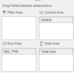
Note: The "Default" item in the Column Area is the default timeline, located in the Timescales folder of the Fields List.
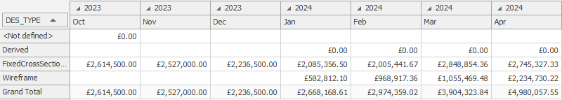
This could, for example, generate pivot table data like this:
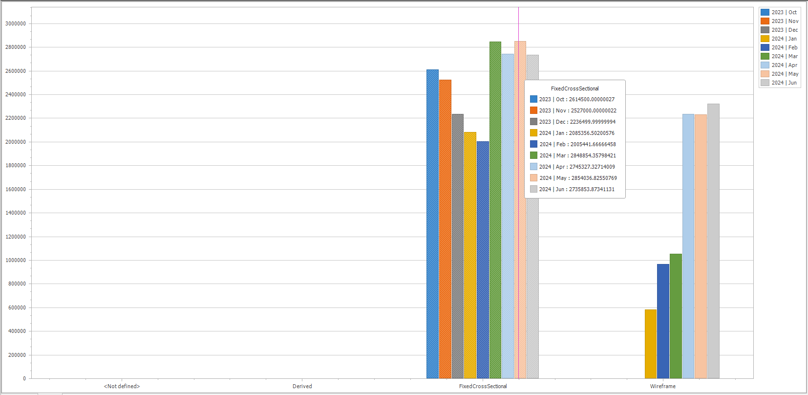
A chart of these results could look like this (note the details shown on the chart tooltip, which details the additional pivot table elements):
Note: A chart is displayed for all selected pivot table data. This means you have to selected table data before clicking the Chart tab.
Create a New Pivot Table Chart
To create a new, empty pivot table:
-
Load the schedule containing data to pivot.
Note: Each schedule will create its own new window to display a pivot table related to that schedule.
-
View ribbon >> Create New View >> Pivot Table.
A new pivot table view with default settings displays. The tab at the top of the screen shows the name of the active project.
-
Configure your pivot table so that values appear in the expected rows and columns. See Create a Pivot Table.
-
Select the table rows that you want to represent in a bar chart.
Tip: Select contiguous table cells, or separate groups of table cells by holding down CTRL, then selecting data.
-
Select the Chart tab at the bottom of the screen.
A chart of the pivoted data displays.
Note: Pivot table data is deselected if the table configuration changes. If you adjust pivot table elements (Row Area, Column Area and so on) whilst a chart displays, you will need to return to the pivot chart and redisplay and reselect data values before clicking the Chart tab again.
Related topics and activities