
Cross Plot
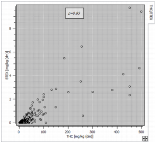
The ![]() Cross Plot item shows a scatter plot between any pair of variables among the selected ones (or their Log10 transformation if the option Use log10 scale is activated), that is the representation of two variables in a X-Y diagram. Each sample, where both variables are defined is represented by a symbol whose coordinates correspond to the values of each variable. The two variables of the pair do not play a symmetrical role. The target variable (Y) is displayed along the vertical axis, whereas the horizontal axis corresponds to the conditioning variable (X).
Cross Plot item shows a scatter plot between any pair of variables among the selected ones (or their Log10 transformation if the option Use log10 scale is activated), that is the representation of two variables in a X-Y diagram. Each sample, where both variables are defined is represented by a symbol whose coordinates correspond to the values of each variable. The two variables of the pair do not play a symmetrical role. The target variable (Y) is displayed along the vertical axis, whereas the horizontal axis corresponds to the conditioning variable (X).
-
The Swap variables option allows interchanging target and conditioning variables.
Note: The experimental conditional expectation curve and the regression line are different when inverting the target and the conditioning variables.
-
Use log10 scale to apply a log10 transformation on the associated variable. Remember that the logarithmic scale can only display variable with positive values. When the option is activated, samples associated with negative values are discarded.
Note: When the option is activated, the correlation coefficient which is displayed is the one calculated thanks to the transformed variable.
- Use same bounds on both axes to have the same graduation following the X and Y axes. This option is useful when comparing two variables of the same nature.
This item also calculates:
- If several variables are defined, the correlation matrix summarizing the correlations between each pair of variables is added. By default, the Linear correlation is calculated. This coefficient (Pearson correlation coefficient) measures the linear correlation ρ between two sets of data. Choosing the Rank correlation option allows you to also calculate and display the Spearman rank correlation coefficient rs. It assesses how well the relationship between two variables can be described using a monotonic function. The Spearman correlation coefficient is of particular interest when the relationship of the two studied variables is not linear. Be careful that this calculation requires the whole variables in memory.
-
The program allows two different types of representation, the classical one (by default) draws a point each time the two variables are informed. The second one (Display as image) uses a discretization of the graphic in cells, each cell being colored according to the number of pairs falling inside this cell. This representation is particularly useful when the number of samples is very large.
Note: If a weight variable is used in the calculations, this is the sum of the weights falling inside a cell which is represented.
- The Linear regression line between the target variable and the conditioning variable (Y|X). The equation of the regression line is printed in the description of the reported graphic.
- The First bisector line. This option is useful for two variables of the same nature if you want to analyze where they differ (for example, an estimated value versus the corresponding true value).
- The experimental Conditional expectation curve which plots the points representing the mean value of the target variable calculated for several ranges of the conditioning variable.
- The Standard deviation around the expectation curve which plots two additional curves which correspond to the expectation curve plus or minus the standard deviation calculated on the points of each class.