
Histogram Charts
To access this screen:
-
Open the Histogram screen, select the Charts tab.
The Histogram Charts screen lists the available histogram charts and is used to select or delete charts and access the chart parameters and model fitting settings.
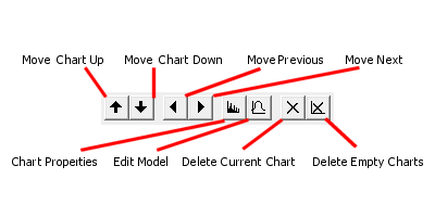
The Charts Toolbar
-
Use Move Chart Up/Down to sort the order in which multiple chart entries are listed. Selecting one of the up or down arrows moves the selected item in the corresponding direction.
As charts can be added to a plot sheet as a multi-page component, it is often useful to sort the charts into a sensible order. If charts are to be displayed in a table form (that is, showing several charts simultaneously), this order also dictates the left-right and top-bottom ordering of the chart previews on the plot sheet. See Chart Properties.
-
Use Move to Previous/Next Chart to select and preview the previous or next chart in sequence.
-
Click Edit Chart Properties to edit the global display parameters for the selected chart, using the Histogram Properties screen.
-
Click Edit Model Properties to fit a standard deviation model to the current data series, using one or more distribution components, on the Fit Model screen.
-
Click Delete Current Chart to remove the current chart from the table. This operation cannot be undone, but missing charts can be replaced by regenerating them.
-
Click Delete Empty Charts to remove charts that contain zero data from the table.
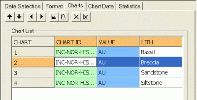
The Chart List
Review the Chart List table. It lists histogram charts in the following columns:
-
CHART: a read-only index field representing the unique numerical identifier, or UID, for the chart.
-
CHART ID: a unique alphanumeric description of the chart in the following format:
Histogram of #Value Field#, #Key Field 1# #Key Value 1#, #Key Field 2# .... -
#KEY FIELD n#: a column is displayed for each key field identified on the Data Selection tab. Each row in the Charts list represents a unique combination of these values.
Compound Charts
If a Compound chart is selected on the Data Selection tab, individual rows representing data series are still shown in this list. In this situation, selecting a row in the table will have no effect. However, where Individual charts have been generated, selecting each data row will automatically update the preview panel to show the chart that is relevant to the selection as shown in the example below:
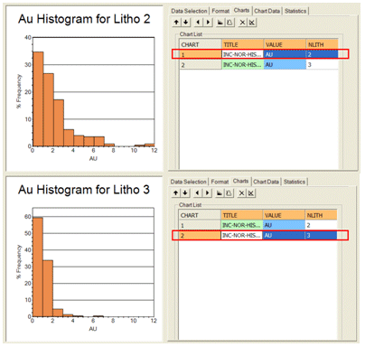
Each row of the table displays information about the parameters that define the data range.
Related topics and activities: