
Previewing Histogram Data
To access this area:
-
Double-click an existing Histogram plot item or sheet. The Histogram Preview area is permanently fixed on the left side of the Histogram screen.
The Histogram screen's preview area is used to select and preview a chart.
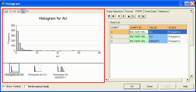
The preview area appears on the left
The Preview Toolbar
The preview area has a dedicated toolbar which can be displayed by selecting the Show Toolbar check box at the bottom of the screen:
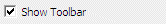
Once enabled, the toolbar is revealed, and can be repositioned as required by dragging and dropping.
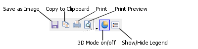
The Preview toolbar contains the following functions:
-
Click Save as Image to save the current chart image to a standalone image file. Files can be saved in .bmp, .jpg, .jpeg, .tiff, .gif or .emf formats.
-
Click Copy to Clipboard to copy the contents of the preview area to the clipboard. This information can be pasted into any external application that supports pasted image metadata.
-
Click Print to send the displayed graph to any supported local or network printing device. This launches your system's print control screen.
-
Click Print Preview to preview your hard copy output using the Print Preview screen.
-
Click Select Colors to display presets that customize the appearance of your chart. This menu also includes Edit Palette..., which is used to define a new palette using the Color Collection Editor screen.
-
Click Select Chart to display all charts included in a compound chart. Selecting a chart in this list displays the Chart Series Style screen, allowing you to format the graph display in more detail. If multiple charts have been generated, only one chart is selectable.
-
Toggle 3D Mode to enable or disable 3D chart mode. If this option is enabled, rotate the chart in the preview area by dragging the mouse with the right button held down. If the option is disabled, a 2D flat view is set automatically and no rotation can be performed.
-
Toggle Show/Hide Legend to show or hide the chart legend. The chart legend is displayed by default.
Performance Mode
When working with large data sets, the speed performance of the Histogram screen e.g. while generating and refreshing histogram chart previews, can be increased by selecting the Performance Mode option. This is located below the Chart Thumbnails and Preview Panes:
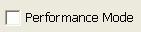
Once selected (ticked), the chart thumbnails and the histogram chart plot item is temporarily hidden; these can again be displayed by turning this option off.
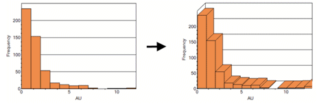
2D or 3D?
Histograms can be displayed as either 'flat' (orthogonal) items or as isometrically rotated graphics. By default, all histograms are generated in the flat mode, but this can be altered by selecting the 3D Mode icon ![]() in the Preview Toolbar and then using click-and-drag on the histogram chart in the preview pane to adjust the rotation angles:
in the Preview Toolbar and then using click-and-drag on the histogram chart in the preview pane to adjust the rotation angles:
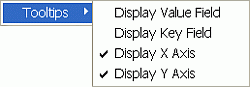
Context Menu Options
Right-clicking in the preview area displays the following context menu:
-
Use Display Value Field to show or hide the value field name. This is the Value Field defined in the Data Selection tab.
-
Use Display Key Field to show or hide the key field name and value. This is the Key Field defined in the Data Selection tab.
-
Use Display X Axis to show or hide the X Axis data value, which is shown by default. This is the X Axis defined in the Data Selection tab. The values displayed include the lower and upper bin values for a normal scale, and lower and upper untransformed values for a log scale.
-
Use Display Y Axis to show or hide the Y Axis data value, which is shown by default. This is the Y Axis defined in the Data Selection tab.
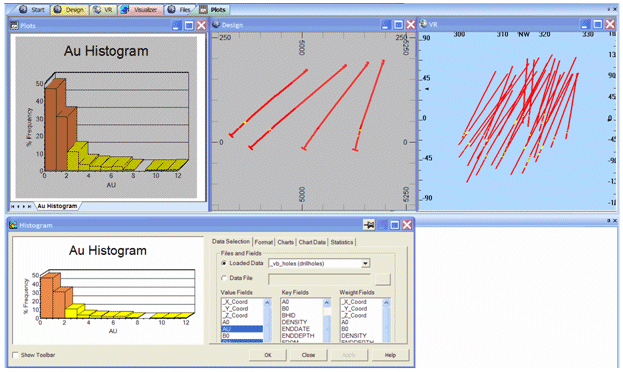
Interactive Data Selection
If drillhole or points data is selected on the Histogram screen as a loaded data object then the preview panel's functions are expanded to allow you to 'link' to this data in the Design window. This connection allows you to select an interval in a graph and have that selection of data automatically highlighted in the 3D window.
Note that this interactive selection is not implemented for wireframe, block model or string data.
It is possible to select more than one interval using the <CTRL> key - all selected data is highlighted:
Compound Charts
A single chart can contain one or more histograms as illustrated in the graphic below which shows AU histograms for two different rock types. A compound chart is displayed by selecting the Compound Chart option on the Charts Layout area on the Data Selection tab of the Histogram screen.
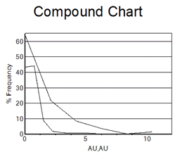
The chart for each data set can be edited independently using the Select Chart icon on the preview panel's toolbar. This displays the Chart Series Style screen that can be used to change a wide variety of formatting options for each set.
Related topics and activities: