|
|
Scatter Plots - Format Changing the visual format of data points |
Scatter Plots - Format
To access this dialog:
-
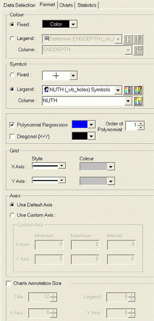
Open the Scatter Plots dialog, select the Format tab.
This Format tab is used to manage the global scatter plot color, symbol, grid, axes and annotation settings; fit a regression line.
|
|
Formatting is universal to all charts that are shown in the Charts List. It is not possible to define individual Appearance options for each chart. |

Field Details:
Colour: this group contains the color controls for the chart point data:
-
Fixed: select this option to color all point data with a fixed color.
-
Color Palette drop-down: select the required fixed color, if the Fixed option is selected.
-
Legend: select this option to color all point data using a color legend.
-
Legend Name drop-down: select an existing legend from the list, if the Legend option is selected.
-
Show Legend button: click this to preview the selected legend.
-
Edit Legend button: click this to open the Legends Manager.
-
Column: select the data column to which the selected Legend Name applies.
-
Edit Legend button: click the to apply a default legend to the selected data column.
|
|
Colour Legends can be used with 3D and non-3D data, for both Loaded Data and Data Files. |
Symbol: this group contains the symbol style controls for the chart point data:
-
Fixed: select this option to use a fixed symbol for all point data.
-
Symbol Palette drop-down: select the required symbol style, if the Fixed option is selected.
-
Legend: select this option to set symbol styles using a legend.
-
Legend Name drop-down: select an existing legend from the list, if the Legend option is selected.
-
Show Legend button: click this to preview the selected legend.
-
Edit Legend button: click this to open the Legends Manager.
-
Column: select the data column to which the selected Legend Name applies.
-
Edit Legend button: click the to apply a default legend tot he selected data column.
Regression Analysis: this group contains the controls for the regression analysis lines:
-
Polynomial Regression: select this option to fit and draw a polynomial regression line.
-
Color Palette drop-down: select the required color for the polynomial line, if the Polynomial Regression option is selected.
-
Order of Polynomial: define the order of the polynomial function (default '1').
-
Diagonal: select this option to draw a Y=X line.
-
Color Palette drop-down: select the required color for the diagonal line, if the Diagonal option is selected.
|
|
The regression analysis coefficients and statistics are displayed in the Charts tab, Regression Analysis pane. These values are updated when either the Polynomial Regression or the Order of Polynomial parameter is modified and Apply is clicked. |
Grid: select the grid line Style and Colour for the X and Y axes using the drop-down lists.
Axes:
-
Use Default Axis: a default axis format will be used to define the minimum and maximum values of each axis.
-
Use Custom Axis: select this option to define custom minimum and maximum axes limits. The fields below are automatically populated with suggested values to ensure that all graph details are initially visible:
-
-
Minimum: set the minimum value for the X or Y axis. This must be a numeric value that is lower than the Maximum.
-
Maximum: set the maximum value for the X or Y axis. This must be a numeric value that is higher than the Minimum.
-
Interval: enter the intervals between value labels on either X or Y axes.
-
Charts Annotation Size: tick this box to define custom annotation font size settings.
-
Title: select a font size from the drop-down.
-
Legend: select a font size from the drop-down.
-
X Axis: select a font size from the drop-down.
-
Y Axis: select a font size from the drop-down.
Using Legends
If a display legend is used, both the Legend and data Column need to be selected. Display legends are a useful way of applying conditional formatting to data overlays. In essence, a legend contains the information that dictates which data value(s) will be assigned to which display property. Each legend interval (or 'bin') is dictated either as a unique value, a range or a filter expression. For more information on legends, please refer to your Legend Manager's dedicated online help file. Once defined, a legend is matched against values in a specified data column. The resulting color number is used for displaying the point on the plot. If a legend is being used, you can also use the associated buttons to preview or edit the selected legend. Finally - if you wish to create a legend using default settings for the selected data column, select the Use Default Legend button.
|
|
When a legend is used, if a color number cannot be matched against a known symbol shape, the Fixed color will be used instead. |
Similar to the Color setting (see above), you can use a Fixed symbol or determine a symbol according to a data field in the loaded data object, using a symbol Legend. Note that if a legend is used, if a symbol number cannot be matched against a known symbol shape, the Fixed symbol will be shown instead.
| | Related Topics |
| Scatter Plot Charts |


