
Histogram Statistics
To access this screen:
-
Open the Histogram screen.
-
Select a chart from the histogram thumbnails pane.
-
Select the Statistics tab.
The Histogram Statistics screen is used to define which summary statistics will be displayed on your histogram chart.
Note: The Statistics tab only contains data if the Individual Charts option was selected on the Data Selection tab. It is otherwise empty if the Compound Charts option was selected.
To configure these settings:
-
Check Display Parameters Graphically to display selected statistics graphically on the chart.
-
Choose a colour for Mean, Log Est Mean, Geometric Mean, and Percentiles as required.
-
-
Review the statistics grid, then check the statistics that you want to display in the chart statistics box.
-
Check Column Header Rows to include the NAME, VALUE, and DECIMALS column headers.
-
Edit the DECIMALS value for any statistic that needs a different number of decimal places.
-
-
Review the preview after each selection. The preview updates automatically with the relevant information.
Note: For the purpose of generating the log statistics, Sum of Logs, Mean of Logs, and Logarithmic Variance, all selected Value Field values that are <= 0, zero, or absent, -, are ignored. Logarithmic values are calculated to base e.
Available Statistics
Use the descriptions below to decide which statistics to display for the selected histogram chart.
-
Total Records: the total number of data records for the selected object or file. This includes all keys and records with absent data values.
-
Total Samples: the total number of samples used to create the current chart. This takes into account any key fields that have been specified for the chart, but does not include records with absent Value or Weight fields.
-
No. of Missing Values: the number of samples not used to create the current chart. This is the difference between Total Records and Total Samples.
-
No. of Values > Trace: the number of values greater than the trace value. The trace value is defined as 0.10E-29, so values greater than trace are effectively values greater than zero.
-
Maximum: the maximum value used to create the current chart.
-
Minimum: the minimum value used to create the current chart.
-
Range: the range of data values. This is equal to Maximum-Minimum.
-
Total: the sum total of all values used to create the current chart.
-
Mean: the mean of all values used to create the current chart.
-
Variance: the statistical variance of the values used to create the current chart. This is calculated as:
Variance = ∑( xi– ẍ)2/ n = [ ∑xi2– (∑xi)2/ n ] / n
where xi are sample values, ẍ is the mean of the samples and n is the number of samples.
-
Standard Deviation: the square root of the variance.
-
Standard Error: also known as the standard error of the mean. It is calculated as the Standard Deviation divided by the square root of Total Samples.
-
Coefficient of Variation: the ratio of the Standard Deviation to the Mean.
-
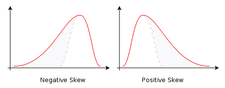
Skewness: a measure of the asymmetry of the probability distribution of a variable. A negative skewness indicates that the left tail is longer than the right. A positive skewness indicates the opposite. A Standard Normal distribution has a skewness of zero:
-
Kurtosis: a measure of the peakedness of the probability distribution. A high kurtosis distribution has a sharper peak and longer, thinner tails, while a low kurtosis distribution has a more rounded peak with wider shoulders. A Standard Normal distribution has a kurtosis of zero:
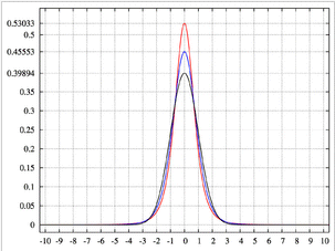
Image showing a high-kurtosis peak in red, and lower-kurtosis results in blue.
-
Geometric Mean: a type of average calculated by multiplying the n sample values together and then taking the nth root of the product.
-
Sum of Logs: the sum of the logs, base e, of the sample values.
-
Mean of Logs: the mean of the logs, base e, of the sample values.
-
Logarithmic Variance: the variance of the logs, base e, of the sample values.
-
Log Estimate of Mean: an estimate of the arithmetic mean of the samples, assuming a lognormal distribution.
-
Correlation Coefficient: a measure of the degree of linear correlation between two variables, here the Y Axis and X Axis field values. These two variables are said to be correlated if the chart data shows a significant rectilinear, or straight-line, trend. Correlation coefficient values range from -1, a straight line with negative slope, to 1, a straight line with positive slope. Both ends of this range indicate strong correlation between the variables; a lack of straight-line correlation is indicated by values close to zero.
The formula used to calculate the correlation coefficient (cc) is as follows:
cc = (N * ∑XY - ∑X*∑Y) / sqrt((N*∑XX - ∑X*∑X) * (N*∑YY - ∑Y*∑Y))
where:
-
N is the number of pairs.
-
∑X is the sum of the X values.
-
∑Y is the sum of the Y values.
-
∑XY is the sum of the product of X and Y.
-
∑XX is the sum of the product of X and X.
-
∑YY is the sum of the product of Y and Y.
-
Note: The correlation coefficient value is the same in each of the Y Axis and X Axis columns, as the value is calculated using both sets of values. All other statistics listed in the table are calculated separately for each axis.
-
5th ... 95th Percentile: the value of the variable, X Axis or Y Axis fields, below which the Nth percent of values fall. These percentile values are calculated separately for each of the Y Axis and X Axis values.
Displaying the Statistics on the Chart
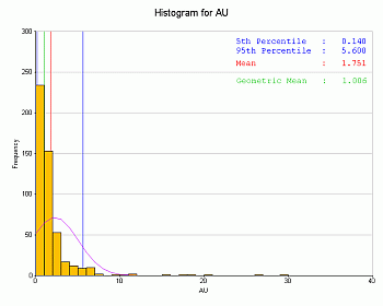
Selected statistics are shown above each chart, aligned to the left border, for example:
Select a check box on this panel to automatically update the preview with the relevant information. The values to be displayed are shown in the green column in the table.
By default, the displayed statistics are positioned at the top left of the chart. You can reposition them by dragging them with the mouse cursor.
Related topics and activities: