
Optimization Charts
Note: your application also maintains a legacy charting functions available using the Optimization ribbon, and can also display spider graphs representing the sensitivity of the current base case to economic model and ultimate pit variable value changes.
Your application provides a rich reporting system so you can quickly view and analyse the results of each aspect of life of mine planning.
Charts provide a useful way to present your strategic planning data.
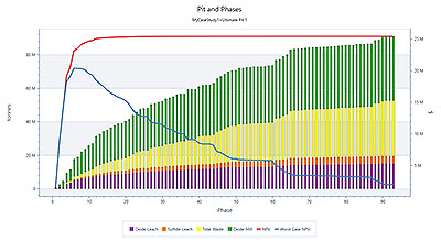
A typical Pit and Phases chart showing rock mass by ore type
Chart axes are customisable, with up to 5 Y axes supported. You can report against system (optimization workflow generated) fields or calculated fields based on your own formulae. Each axis can be formatted independently and exporting your chart data to the clipboard or as a PNG ready for embedding in other reports (including Plot sheets) is simple.
Charts are saved to your project, and you can share report configurations using a template facility.