
Histograms: Data Selection
To access this screen:
-
Open the Histogram screen. The Data Selection tab displays by default.
Use the Histograms: Data Selection screen to define histogram data source, chart types, layout and histogram parameters.
Choose a base chart type (either an incremental, cumulative or probability plot) and display weighted or unweighted results, with an optional keyfield categorizer.
This screen determines the results displayed in your chart.
Tip: show your bin and line charts in 3D by right-clicking and dragging them, for example: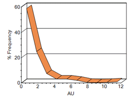
To create a histogram chart to evaluation loaded data:
-
Select the data containing the values to evaluate. All tabular data can be interrogated, whether it contains geometry or not.
-
Choose Loaded Data to select a loaded data object.
-
Choose Data File and browse for a physical Datamine file on your PC.
-
-
Choose one or more Value Fields.
Value fields include the complete set of numeric fields in the input data. It is possible to select up to 10 value fields to be displayed in histogram charts. At least one value field must be selected before a histogram can be displayed.
Note: once a Value Field is chosen, it disappears from both Key Fields and Weight Fields lists (see below).
-
Choose one or more Key Fields.
Key fields are optional, and up to 5 fields may be selected. The selection of a key field causes a separate histogram to be created for each different value within that field (unless the Compound Chart option is enabled - see below).
For example, you may want to create independent charts for grade results across multiple mineralization codes as key fields.
Note: In addition to charts generated for each key field, the first chart in the series is a non key field chart containing all data.
-
Choose one or more Weight Fields.
Weight field selection is optional. Value Fields selections (see above) are weighted by the selection before being represented in the chart. Up to 3 weight fields may be chosen. If multiple weighting fields are specified, the combined weight is calculated by multiplying the individual weight values together.
Tip: multiple value, key or weight fields can be selected or deselected using the CTRL key.
-
Display one or more Chart Types from one of the following base options:
-
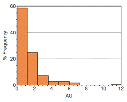
Incremental Histogram—a graphical display of tabulated frequencies, shown as bars. It illustrates the proportion of cases which fall into a series of designated categories or bins:
-
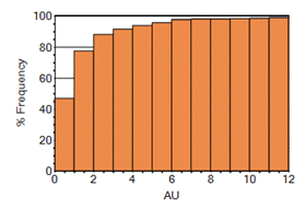
Cumulative Histogram—a graphical representation that accumulates all the samples in all of the bins up to the specified bin. As above, these are represented as bars or lines:
-
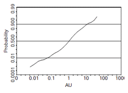
Probability Plot—a graphical representation used for assessing whether the selected dataset follows a normal or lognormal distribution. The straightness of the line indicates how close the distribution is to a normal or lognormal distribution:
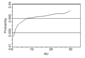
Note: probability plots can be shown as lines or points (see below).
-
-
For each chart type, choose which type of value distributions are displayed us the Normal and Log options.
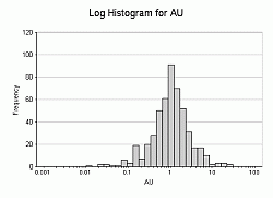
For each of the chart types, Normal and/or Lognormal scaled chart variations (i.e. for the Value axis) can be generated. A Log ('lognormal') distribution is a single-tailed probability distribution whose logarithm has a normal distribution. The graphic below shows a log probability plot, incremental histogram and an incremental log histogram:
How are Values Treated for Log Chart Types?
For the purposes of chart generation, all values (i.e. those for the selected Value Fields), which are <= 0 (zero) or absent (-), are ignored. This means that the number of effective samples is reduced.
Logarithmic values are calculated to base 'e'. -
Choose to display either a Bin (bar), Line or Point chart,
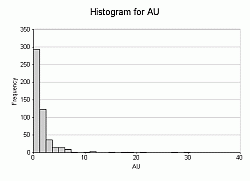
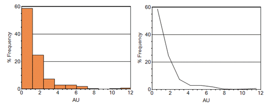
Incremental and Cumulative Histogram types can be shown in any of the formats above. Here's an example of a simple one-variable frequency chart for AU in both bin and line formats:
Probability charts can be displayed as either Line or Point formats.
-
Choose between a Frequency and %Frequency result.
By default, for Incremental and Cumulative histograms the Y axis annotation shows the number (frequency) of values falling within a bin. An alternative is to show the percentage frequency, that is, the number of values in a bin expressed as a percentage of the total number of values.
-
Choose the general Histogram Parameters:
-
Ignore Samples Out of Range – Select this option to exclude data that are less than the minimum or greater than the maximum values (as specified on the Format tab). Chart generation will be performed as if those data values were missing from the data set.
-
Place in bottom/top histogram bin – Select this option to place data in the lowest or highest bin if the data are respectively either less than the minimum or greater than the maximum (as specified on the Format tab).
-
Minimum No. of Samples – Define a value for the minimum number of required samples for histogram generation; below this, the chart will not be calculated and displayed; as a general statistical rule of thumb, this value ranges from 45 - 120.
-
-
The following Chart Layout options are available:
-
Individual Charts – Generate an individual histogram for each individual data set defined by the selection(s) made in the Value Fields and Key Fields lists. Each chart will be listed independently on the Charts tab and will be displayed individually. You can also edit the histogram chart's properties to facilitate display of these multiple charts in a tabular arrangement.
See Chart Properties.
-
Compound Chart – Generate a chart that contains data from more than one chart. Compound charts are constructed from the same chart-generation rules as their individual chart equivalents, but only one chart will be created.
Tip: A common use for a compound chart would be to compare the histograms of a single Value field for different Key values. For example to compare the histograms of Au for different rock types.
Tip: when displaying compound charts, try setting the chart type to Line (see above) to prevent bars being hidden behind others in a 2D view. Alternatively, try viewing compound charts with the 3D view enabled.
-
- Choose if you want to Delete Empty Charts.
- If checked, charts that contain no values are not displayed.
- If unchecked, all chart combinations display, even if they contain no data.
- Review the chart Summary. This read-only section of the panel shows a summary of the main parameters used to create the Histogram chart:
No. of values: this denotes the number of Value Fields that have been selected (one or more).
No. of values for key field n: the number of unique values of each Key Field is shown.
No. of chart types: this row indicates how many different chart types have been specified.
Maximum number of charts: this value denotes the number of individual charts that will be created.
Related topics and activities