|
|
Charts - Chart Series Style Advanced chart formatting options |
Chart Series Style
To access this dialog:
-
In the Histogram or Scatter Plot dialog, ensure that the Show Toolbar checkbox (bottom left corner of dialog) is ticked.
-
Select a chart from the chart thumbnails pane, click the Chart Legend icon
 (i.e. toggle on), double-click a colored box next to a legend item.
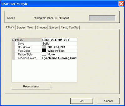
The Chart Series Style dialog is used to format the display of the histogram or scatter plot data series.

This dialog contains the following tabs:
-
Interior: set the basic visual formatting for each bar or line, including foreground and background color etc.
-
Border: edit the border of the chart items, including color and thickness.
-
Text: for all displayed text, this tab is used to control all font formatting, including alignment options.
-
Shadow: define bar shadow settings.
-
Symbol: the symbol used to denote the bin values can be configured here.
|
|
|
| |
Related Topics |
|
|


