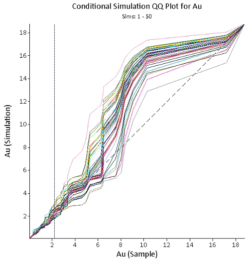
Viewing QQ Plots of Conditional Simulation
The Conditional Simulation Q–Q plot is generated upon completion of the Simulation Generation process. The Q–Q plot compares each of the simulations against the original data and plots all lines onto one graph.
Each line on the plot represents a single simulation, compared to the original data. As a general rule, the simulation results should be similar to the original input data, so they should be close to the 1:1 grey dashed line.
The blue dashed line represents the sample mean. Ideally, this line should intercept the simulation lines on the 1:1 line. Significant deviation from the original data may require further investigation to determine the cause.