
Chart Designer
To access the Chart Designer:
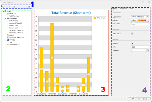
The Chart Designer is used to format dashboard chart items.
Note: Dashboard items are added using the Dashboard Report screen.
The screen is split into the following areas:
-
Chart Designer Toolbar – Add chart elements, change the chart type and undo or redo actions.
Note: You can also change the chart type using the Dashboard Report screen.
-
Chart Elements – The main elements of your chart are listed here. Selecting an item updates the Item Details section on the right (see below).
-
Chart Preview – A preview of the chart with the latest formatting and data values. This updates as details are changed (either using the Chart Elements or Item Details section.
-
Item Details – Define settings for the selected chart item here. Different tabs appear depending on what is selected.
Add Chart Elements
Chart elements relate to the current dashboard item. In this section you configure what chart components are visible on your chart, including data labels and indicators (such as a rolling average indicator or Fibonacci arcs, for example).
The Chart Designer offers several options for chart formatting
The menu system includes expandable elements, such as the Series menu which contains all chart components that relates to the data values the chart represents, or the Titles folder containing all titles (first, second, third level and so on).
Note: You can also click a part of the Chart Preview to show its Item Details.
Where new chart elements can be added, the parent folder item displays a "+" when you hover over it with the cursor, for example, the "+" below lets you add a new title to the chart:
Note: Expand or collapse any menu item either by clicking its expander icon on the left, or right-clicking it and selecting Expand or Collapse. Full Expand and Full Collapse let you fully expand or collapse the entire menu, and is available when right-clicking any menu entry.
For each chart element at the lowest level of the 'tree', you can either show/hide or delete the element, for example:
Note: You can also show and hide chart elements using the Item Details panel (either via the Options or Properties tabs).
The following chart components are defined in this section. Select an item in the tree to update the Item Details section on the right, allowing you to set the properties of the selected item.
-
Series – For each data series of the chart, a secondary level appears with the field name providing the values. Within each series, you can enable or disable data value labels and, if the series supports it, format the data points shown on the chart.
If the data series supports it, you can also add data Indicators, such as a rolling average, rate of change and so on).
Add a new data series to the chart here, using the top level "+" option.
-
[Chart Type] – Expand this section to reveal the components that comprise your chart type. You can format axes (primary, secondary) and the chart frame here.
Add multiple chart panes within the same chart item, using the Additional Panes folder.
-
Legend – Configure the chart legend.
-
Additional Legends – Create additional chart legends.
-
Titles – Configure the default chart title and add other chart subtitles.
-
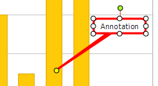
Annotations – Add callouts to a chart, either as text or images. Click "+" on the top level folder to choose between the two.
Configure Chart Elements
To configure a chart element:
-
Display the Chart Designer screen.
-
Select a chart element using either the Chart Elements list or clicking a part of the Chart Preview.
-
Review and adjust the Options in the Item Details panel on the right. These options depend on the element that was selected.
-
Depending on the element selected, a Properties panel may appear in the Item Details section. This displays a full list of all configure chart element properties.
-
If a data Series chart element is selected, a Data panel appears in the Item Details section. Use this to drag and drop data fields into the respective chart data series containers at the bottom of the screen.
-
Click OK to update the dashboard item.
Related topics and activities