
Probability Plot
The ![]() Probability Plot item is meant to compare the distribution of a variable with a secondary distribution (theoretical distribution or distribution of an auxiliary variable).
Probability Plot item is meant to compare the distribution of a variable with a secondary distribution (theoretical distribution or distribution of an auxiliary variable).
This application can produce three types of graphic: Quantile-Quantile plots, Probability-Probability plots and Normal-Probability plots.
-
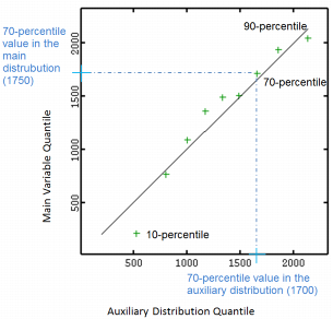
Quantile-Quantile Plot (QQ-Plot)
For a set of quantiles, the QQ-Plot draws the value of a given quantile of the main variable against the value same quantile of the secondary distribution.
In following graphic, each cross corresponds to a given quantile (9 percentiles, from 10 to 90-percentile) and is associated with the corresponding value on the main variable distribution (horizontal axis) and the corresponding value on the theoretical distribution (vertical axis). For example the 70-percentile is valued at 1700 in the secondary distribution while valued at 1750 in the main variable distribution.
-
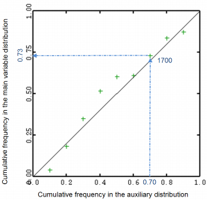
Probability-Probability Plot (PP-Plot)
For a given number of quantiles of the secondary distribution, the PP-Plot draws the frequency attached to a quantile value in the main variable distribution against the frequency attached to this quantile in the secondary distribution.
In following graphic, each cross corresponds to the value of a percentile of the secondary distribution and is associated with the corresponding frequency on the main variable distribution (horizontal axis) and the corresponding frequency on the theoretical distribution (vertical axis). For example, the 70-percentile in the secondary distribution (valued at 1700 in the previous graphic) corresponds the 73-percentile in the main variable distribution.
-
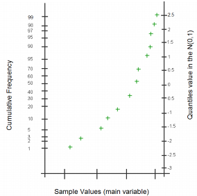
Normal-Probability plot (NP-Plot)
The NP-Plot draws the sample values against their corresponding cumulative frequencies. It is similar to a cumulative histogram but the vertical axis has a specific graduation based on the quantile values of the N(0,1) distribution as shown below:
When the main and secondary distributions are linearly linked, the QQ/PP-Plots are distributed along a line. If the two distributions are similar, then the QQ/PP-Plot follows the first bisector. QQ/PP-Plot generally shows an "S" shape, meaning one distribution is more skewed than the other one, or one distribution has heavier tails than the other one.
If the NP-Plot shows plots lined up with the first bisector, then the variable has a Gaussian distribution based on the mean and standard deviation of the main variable itself.
-
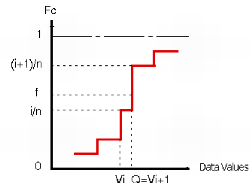
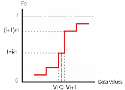
Algorithm: Quantiles in Isatis.neo are calculated using the cumulative histogram. Two cases are distinguished:
-
When the frequency f attached to the quantile to be calculated falls on a vertical portion of the curve, i.e. between two cumulative data frequencies i/n and (i+1)/n (n being the total number of defined samples), the quantile equals to the value of the second data point Q=Vi+1.
-
When the frequency f attached to the quantile to be calculated is equal to the cumulative frequency i/n of the point i, the quantile is taken arbitrarily as Q=(Vi + Vi+1)/2.
-
-
Calculation Parameters:
- Discard Extreme Values: The two parameters Lower Bound and Upper Bound are meant to discard insufficient representative samples. Enter the value corresponding to the smallest/highest values of the selected variable to be discarded before computing the quantiles. By default these parameters are set to the minimum and maximum values of the variable distribution. In this way, all the samples are considered.
- Representation Type: Select the type of graphic you want to display: QQ-Plot, PP-Plot or NP-Plot.
- Number of Quantiles: Enter the number of classes in which the remaining samples are split.
-
Compare to: Select the comparison option:
- When selecting Compare to Theoretical Distribution, the experimental distribution of each selected variable is compared to a theoretical reference distribution. You have then to define the following parameters:
-
Distribution: You may choose among the following theoretical distributions, the Gaussian distribution being set by default:
- Gaussian: You have to specify the Mean and the Standard Deviation of the theoretical gaussian distribution. By default, the Mean and the Standard Deviation are set to the mean and the standard deviation of the current variable.
- Lognormal: You have to define the Shift (beta) of the Lognormal distribution and the Mean and the Standard Deviation of the theoretical gaussian distribution. The graphic then plots the distribution of the shifted logarithm of the current variable ln(z+beta) versus a theoretical gaussian distribution.
- Power: You have to define the Exponent (lambda) of the power distribution and the Mean and the Standard Deviation of the theoretical gaussian distribution. The graphic then plots the distribution of the current variable raised to the power lambda versus a theoretical gaussian distribution.
- Uniform: You have to define the Minimum value and Maximum values. By default, the Minimum and Maximum are set to the minimum and maximum values of the current variable.
- Gamma: You have to define the index Alpha(a) of the gamma distribution and a Scale factor (beta). The graphic plots the current variable distribution versus the theoretical gamma distribution.
-
Exponential: You have to define the Exponent of the exponential distribution. The graphic represents the current variable distribution versus this exponential distribution:

-
Perform Chi-2 Test: The quality of the fit can be quantified by a Chi-2 test. This test requires the definition of classes. If m and sigma respectively designate the mean and the dispersion standard deviation of the data, the classes are defined so as to regularly cover the interval:

where k (Number of Standard Deviations) and the Number of Classes are given by the user.
If a weight variable is used in the calculation, the Chi-2 test is modified accordingly.
When asking for a Chi-2 test, the details and results of the test are sent in the Messages window.
-
When selecting Compare to an Auxiliary Variable, the experimental distribution of each selected variable is compared to the experimental distribution of any variable in the current study.
Click Data Table to open a Data Selector to select the data on which the comparison will be applied. The Data Table can also be dragged and dropped directly from the Data tab.
You can define a Selection variable (as a restriction of the input Data Table) to apply the Migration task.
Select the Variable, i.e. the distribution of which will be compared to the current variable distribution considered now as the reference.
An optional Weight variable can be taken into account in the calculations.
-
Display: This item also calculates:
- Use Log10 Scale to see the histogram with a Log10 scale for the vertical/horizontal (main/auxiliary variable) axis. This option may be interesting to correct the dissymmetric distribution that we can observe with a lot of low values and some high values.
- The Linear Regression line between the target variable and the conditioning variable (Y|X).
- The First Bisector Line: This option is useful for two variables of the same nature if you want to analyze where they differ (for example, an estimated value versus the corresponding true value).