
Scatter Plots: Charts
To access this screen:
-
Open the Scatter Plot screen, select the Charts tab.
The Scatter Plots: Charts screen lists the available scatter plot charts and is used to select or delete charts, access the Chart Parameters screen, and view the Regression Analysis parameters for the selected chart.
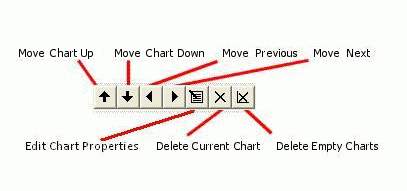
The Charts Toolbar
If Multiple Charts have been created, additional options are shown along the top of the Charts panel. Use the Charts toolbar to work with each data range.
-
Use Move Chart Up/Down to sort the order in which multiple chart entries are listed. Selecting one of the up or down arrows moves the selected item in the corresponding direction.
-
Use Move to Previous/Next Chart to select and preview the previous or next chart in sequence.
-
Click Edit Chart Properties to edit the global display parameters for the selected chart on the Scatter Plot Properties screen.
-
Click Delete Current Chart to remove the current chart from the table. This operation cannot be undone, but missing charts can be replaced by regenerating them.
-
Click Delete Empty Charts to remove charts that contain zero data from the table.
As charts can be added to a plot sheet as a multi-page component, it is often useful to sort them into a sensible order. If charts are displayed in table form, showing several charts simultaneously, this order also controls the left-right and top-bottom ordering of chart previews on the plot sheet.
The Chart List
Review the Chart List table. It lists scatter plot charts with the following columns:
-
CHART: a read-only index field representing the unique numerical identifier, or UID, for the chart.
-
CHART ID: a unique alphanumeric description of the chart in the following format:
Scatter plot of #X Axis# vs #Y Axis#, #Key Field 1# #Key Value 1#, #Key Field 2# ...
-
#KEY FIELD n#: a column is displayed for each key field identified on the Data Selection tab. Each row in the Charts list represents a unique combination of these values.
Regression Analysis
Review the Regression Analysis table to see the regression coefficients and summary statistics for the selected chart.
-
Polynomial Coefficient(s): up to five polynomial coefficients are listed. The polynomial equation takes the form:
Y = C0 + C1*X + C2*X2 + C3*X3 + C4*X4 + C5*X5where C0, C1, C2, C3, C4 and C5 are the coefficients.
-
Goodness of Fit: calculated using the following equation:
Goodness of Fit = Sum of Squares / Total Variation
where Sum of Squares = ∑X2- [(∑X)2/N].
-
Correlation Coefficient: a measure of the degree of linear correlation between two variables, here the Y Axis and X Axis field values. These two variables are said to be correlated if the scatter plot shows a significant rectilinear, or straight-line, trend. Correlation coefficient values range from -1, a straight line with negative slope, to 1, a straight line with positive slope. Both ends of this range indicate strong correlation between the variables; a lack of straight-line correlation is indicated by values close to zero.
The formula used to calculate the correlation coefficient (cc) is as follows:
cc = (N * ∑XY - ∑X*∑Y) / sqrt((N*∑XX - ∑X*∑X) * (N*∑YY - ∑Y*∑Y))
where:
-
N is the number of pairs.
-
∑X is the sum of the X values.
-
∑Y is the sum of the Y values.
-
∑XY is the sum of the product of X and Y.
-
∑XX is the sum of the product of X and X.
-
∑YY is the sum of the product of Y and Y.
-
-
Std. Error of Estimate: a measure of the standard deviation of the deviations of the data around the fitted model.
Using the Charts Tab
The number of entries that are created depends on how many distinct data series result from the selections made; for example, if multiple charts are being generated for a scatter plot where a total of 25 key field values can be found, 25 charts will be generated.
If a Compound chart is selected on the Data Selection tab, individual rows representing data series are still shown in this list. In this situation, selecting a row in the table will have no effect. However, where Multiple Charts have been generated, selecting each data row will automatically update the preview panel to show the chart that is relevant to the selection:
Related topics and activities: