
Dashboard View
A dashboard lets you assemble one or more charts in the same place.
This can be a useful way to present schedule information that accommodates multiple parameters and reporting properties (revenue over time, revenue by destination, ore tons by remaining mined volume, and so on).
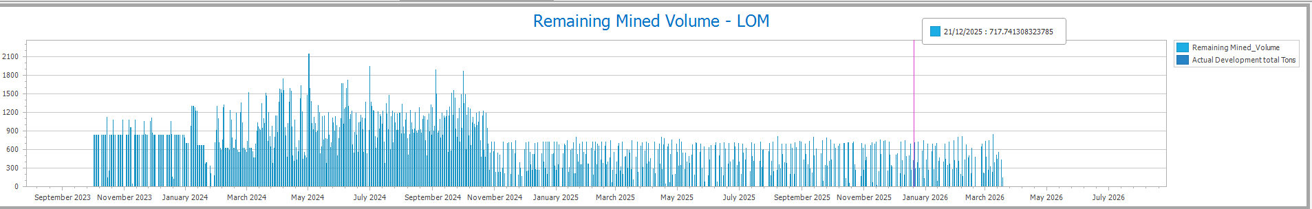
A Dashboard chart showing remaining mined volume over time
A Dashboard view can contain as many charts as you want (referred to as "dashboard items"), with each chart being fully (and independently) configurable using the Dashboard Report and Chart Designer screens. You can even add multiple charts to the same dashboard item, which can be useful for comparing related data.
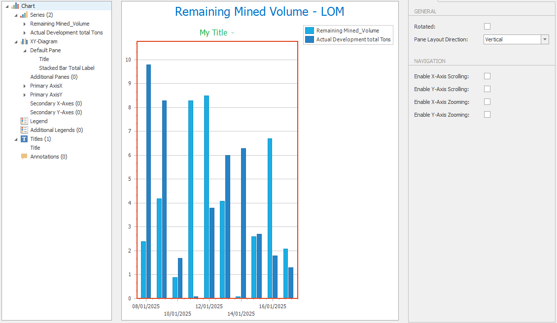
The Chart Designer showing a stacked chart dashboard item
Tip: Disable Design Mode and left-click-drag to rotate the view of 3D dashboard items. See Dashboard 3D Item Key Shortcuts.
To create a Dashboard view:
-
First, load a schedule.
-
View ribbon >> Create New View >> Pivot Table.
A new, empty dashboard is created.
-
Right-click the dashboard and select Add Item to display the Dashboard Report screen.
-
Configure your dashboard chart's details, data source and filter.
-
Right-click your new dashboard item and select Chart Designer.
The Chart Designer screen displays.
-
Format your chart display using the various design options. See Chart Designer.
Related topics and activities