
Compare Previous Scenarios
To compare the results of previous scenarios in chart format.
- Display the Reports window. See Hide or Show the Reports Window.
- Activate the Optimization ribbon.
-
Select Reports >> Compare.
The Reports panel updates to show the Comparison Report tools.
-
Choose the Scenario Type. This will be either:
-
Schedules: outputs for each scenario where an optimised schedule has been successfully run will appear in the Scenarios table.
-
Pits and Phases: scenarios will be listed where the ultimate pithas been calculated.
-
Pushbacks: scenarios will be listed where pushbacks have been calculated.
The Scenarios list updates to show only scenarios that contain output data relevant to the selected Scenario Type.
-
-
Select 2 or more Scenarios to compare. Left-clicking will toggle a scenario on or off. A highlighted scenario will be considered when preparing chart data.
Select Toggle All to compare all available scenario values.
-
Select fields for comparison. Scenario output values will be compared in a multi-bar, multi-line or composite chart (line and bars mixed).
-
Expand each value category (Financial, Rock Mass, Volumes etc.) to reveal the values relevant to that category.
-
Select one, two or three fields to report, e.g. Financial >> Revenue..
Note: a maximum of 3 fields can be chosen. A separate Y axis will be displayed for each field.
-
For each selected value, choose the Chart type.
-
To display the selected chart value for all selected scenarios as a histogram, choose Bars.
-
To display selected scenario values as a line chart, choose Lines.
-
-
-
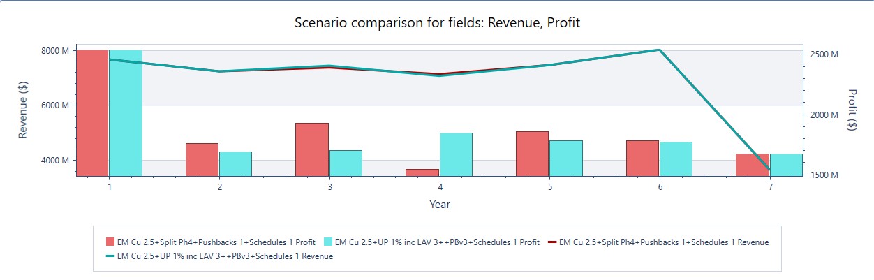
Select Compare chart to generate a chart.
A chart displays representing the selected scenario value(s), using the format chosen for each. For example, the chart below shows a schedule comparison of revenue vs. profit for two planning scenarios. Two Y axes are used. Bars represent profit and lines represent revenues (this is indicated by the legend below):
-
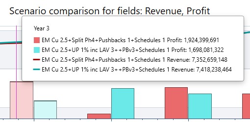
Highlight individual data point details by hovering over the chart, for example:
-
To export chart data for use in other applications:
-
Right-click the chart and select Copy to Clipboard to store a bitmap of the chart on the Clipboard. This can be pasted into other documents/applications.
-
Right-click the chart and select Export to PNG to pick a folder location to save an image file.
-
-
To delete a chart, right click the chart and select Delete.Alternatively, click Cancel to return to the previous screen.
Related Topics and Activities