
Grouped Charts and Reports
To access this screen:
-
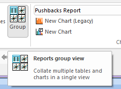
The Reports window must be displayed. Create at least one chart and activate the Optimization ribbon. Enable the Reports >> Group toggle if not already enabled.
Compare chart and table results for previous case studies, and spider graphs showing the results of sensitivity analysis. Toggle between showing independent tabular reports and charts and grouped items using the Optimization ribbon's Group button:
By default, grouped charts and tables are displayed in a left-right and top-bottom order, based on the order in which they were chosen for display. Charts and tables are automatically fitted to the available space.
As other chart and report display views, the layout is customizable; chart and table items can be repositioned and resized, once added to the view. Drag and drop items wherever you like.
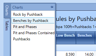
Charts and tables are selected using independent lists. By default, these display when clicked on the left of the display window, for example:
As other view items, these selection lists can also be repositioned within the display window.
Double-clicking a table or chart item adds that chart to the display. Charts and tables are removed from view using their respective 'x' in the top right corner of the item.
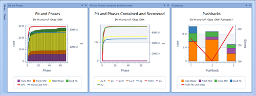
An example of grouped charts
As with the independent tabular and chart report views, you can rearrange the view and access more detail information using context-sensitive functions. See View Optimization Reports & Charts and Manage Optimization Charts.
Note: Grouped data is only displayed for as long as the current display session; toggling group mode to independent report mode and back will clear previously grouped chart items from the display (although existing tables and charts are still present in their respective selection list).
To view standard charts and tables as a group:
The following steps relate to displaying a collection of charts and tables generated independently through the optimization workflow and not as part of sensitivity analysis.
- Open a project with at least one existing summary report or chart.
- Ensure the Reports window is displayed (Home ribbon, Show >> Reports). See Hide or Show the Reports Window.
- Activate the Optimization ribbon.
- Ensure the Reports >> Group toggle is ON.
- Use the Charts and Tables menus on the left to pick one or more tables and charts. Any number of charts and tables can be displayed, in any combination. Double-click an item to add a new display item.
-
Reorganize or resize chart and table items by dragging and dropping them within the Reports window.
Note: In the grouped chart and table view, no tabs appear at the bottom of the screen to select a particular chart/table, unlike the independent chart and table view.
- Define per-chart or per-table settings as per independent view menu options. See View Optimization Reports & Charts and Manage Optimization Charts.
- When finished, either close the Reports window or toggle back to independent chart and report view mode.
Related topics and activities