
(Resource) Bar Chart Options: Layout
To display this screen:
-
Display the Bar Chart Options screen or Resource Bar Chart Options screen and select the Layout tab. The controls for both screens are identical.
This tab allows you to select the bars to be displayed (colour, symbol, or pattern).
Bar Chart Fields
The bar chart can display the following items. Each of these items can be independently controlled with regards to visibility and style.
- Default Bar - Defines the default appearance of the Gantt bars in the Gantt Chart. This field is always displayed.
-
Summary Bar - Selects or deselects the display of a summary bar for each grouping of fields. By default, this field is not selected.
Note: You can have summary bars selected at all times but they only display if you have grouping defined.
- Milestone - Specifies the symbol that represents important event dates (tasks with zero duration). By default, the symbol is a red diamond. To select another symbol, click in the Style field and pick another symbol.
- % Complete - Specifies the bar that identifies tasks assigned as partially or fully completed. This is required for progress reporting. By default, this field is selected.
- Non-work Period - Select this field to display non-working periods, such as weekends, holidays, and shut-down times for the project in the chart background. This field helps in interpreting the visual representation of time frames.
- Critical Bar - Select this to display the critical path for the project. This is the path of activities that defines the end of the schedule.
- Total Float - Select this to display the float of each task. This is the duration that the Task could be delayed before it affects the critical path of the project.
- Baseline - Select this to display any task baselines currently stored in the project. This is illustrated as a half bar. By default, this field is selected.
- Highlighted - Select this to display colouring of the row for any filtered tasks when highlighting is toggled on. This field is toggled on by default when the filter highlighting option is activated for the current filter.
- Dependency Lines - Specifies the visual display of task links. By default, this field is selected.
- Date Line - Select this field to display the current date of the project as a vertical line in the Gantt chart. By default, this field is not selected.
- Sheet Lines (printer only) - Select this to display the horizontal lines separating Activities in the Task Grid for any prints. By default, this field is selected.
- Chart Lines (printer only) - Select this to display the horizontal lines separating Activities in the Bar Chart for any prints. By default, this field is selected.
- User Defined Line# - Select this field to display be able to display the corresponding lines that you selected in the Task Information Screen - Lines tab. By default, this field is not selected.
Format the Gantt Chart
Activity steps:
-
Display the Layout tab.
-
If you have defined code fields (with colours and patterns), expand Color bars using code to pick one.
Selecting a code enables the following fields:
-
Color text with current code colors - Uses the code colors selected in Color bars using code to display text in the table like this:
-
Cyclical Tasks use cycle colors – Select if the development is a cyclic task.
-
Color cells with current code colors – Uses the code colours selected in Color bars using code to display cells in the table like this:
-
-
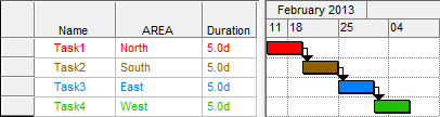
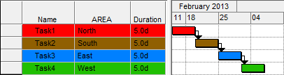
In the table below, select the elements you want to appear in the Gantt chart:
-
Show – Check or uncheck at item to control its visibility.
-
Field – See Bar Chart Fields, above.
-
Style – Click into a cell to see the colour (and pattern) or symbol picker, depending on the basic type of chart element that is selected.
-
-
Click OK to update all displayed bar chart views.
Related topics and activities