
Personalising Screens
Overview
Application screens can be personalised to display items that are most likely used and to enhance workflow by as adding fields, hiding fields, renaming fields, moving field groups and tabs.
CCLAS provides core application screens at installation that can be personalised or customised to best suit you or your organisation.
The difference between a personalised and customised screen:
-
A personalised application screen is one that is modified using the Open Personalisation functionality. The process to personalise an application screen is limited. For this reason, application screens can be customised.
-
A customised application screen refers to an imported application screen whose xml is modified from a core application screen, or newly developed.
This process is about personalising applications.
Process
Screens personalisations are created using the Open Personalisation option from any CCLAS screen, however personalised screens are maintained using the CCCSD—Personalisation application, and allow the screens to be customised for use.
A personalised screen can be given a unique name and tied to a menu item.
Personalisations can have scope of:
- Instance
- Laboratory
- User.
Also new attributes can be added to existing entities (MSECAT, MSEATT). This equates to extending the information held in the database tables: Type, Relationship and Values associated with that particular service and operation.
Screen items are personalised to change the appearance and behaviour of screens that are used regularly, including
- Add custom attributes to an existing field group or tab
- Rename field groups
- Hide fields within a screen
- Delete fields, field groups or tabs
- Rename field labels
- Provide default values for fields
- Develop drop-down lists for input fields
- Re-order fields within a screen.
Once a screen is personalised, the  Personalisation screen personalised icon displays on the top-right corner of the screen.
Note: If a user has personalised a screen, the personalisation applies only to that user. No other user can view or access the personalised screen unless the System Administrator applies the personalisation to users at district or system level.
Accessing the Screen Personalisation Tool
The Open Personalisation option accessed from  Personalisation access in the Application Toolbar is used to personalise a screen.
Note: The Open Personalisation menu item is enabled or disabled by either granting or revoking a user's access to the CUSTOMISATION:CREATE resource. Any users with the MSECSD ALL core right assigned to one or more of their roles are able to open the personalisation widget, otherwise the option is disabled as the CUSTOMISATION:CREATE resource is permitted via the MSECSD ALL core right.
The screen undergoing personalisation displays on the left-hand side.
The Personalise screen tool displays on the right-hand side, and contains a number of panels:
-
The Screen Personalisation Toolbar panel displays at the top of the personalisation tool.
-
The Screen Layout panel displays at the left of the personalisation tool.
-
The Palette, Service Attributes, Recycle Bin and Original Screen tabs display at the right of the personalisation tool.
-
The Properties panel displays on the bottom-right of the personalisation tool.
 Access the screen personalisation tool
Screen Personalisation Toolbar
| Screen icon | Description |
|---|---|
|
Save the personalisation. |
|
Save the details of this personalisation with a different identifier. |
|
Display a preview of the personalisations to the screen. Note: This is a display screen only. No data can be entered into the screen during preview. |
|
Revert to the original screen or the last saved personalisation (if one exists). |
|
Delete the personalisation (if one is saved previously). |
|
Undo the last action. |
|
Display xml of the current application. |
|
Redo the last action. |
Screen Layout
The screen layout, that details the screen's components in a tree structure, displays in the Screen Layout section of the right-hand panel. This comprises all components that make up the application's screen: tab sets, row sets, rows, labels, etc., and components which correspond to the controls on the screen, including those controls that may be hidden on the active screen due to applied behaviours or security.
The items and components display in a hierarchical structure. Definition displays at the top of the hierarchy and represents the screen in its entirety.
-
The Definition can be expanded to view all its associated items and components including Meta, Layout, Actions and Behaviour.
-
The Layout section includes any form, dialogs (for example, dialog boxes), and flows which may display on the screen.
-
The Actions section includes the toolbar actions (Submit, New, and so on) available on screen.
When a component in the Screen Layout panel is selected, then the corresponding component in the Personalised Screen Display is highlighted in blue, and the properties of the component display in the Properties panel of the screen personalisation tool.
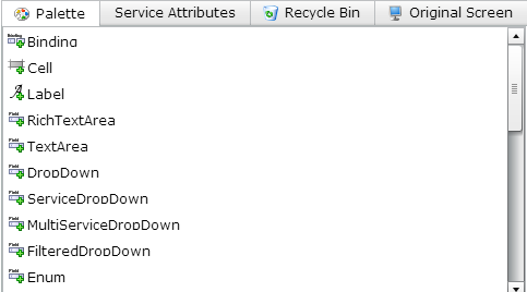
Palette
The items available for adding to the screen display in the Palette tab of the right-hand is panel.

The following components are available in the Palette for adding to the screen:
|
Component |
Description |
|---|---|
|
|
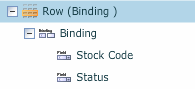
Use this component to bind two or more fields closer together and under the same label. Screen Layout view:
Screen Representation view:
|
|
|
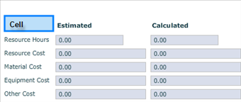
Use this component to enable fields to span multiple columns in a screen layout. A cell is a spacing device that is used to fill up the width of a row, allowing for space between labels and/or fields. Cells assist with the layout of a screen. For example: A cell (highlighted in blue) is placed in the row to provide an empty cell place holder. Effectively, the cell displays blank.
|
|
|
Use this component to add a label, for example, to a field group.
|
|
|
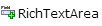
A rich text screen displays where text can be formatted and hyperlinks added. |
|
|
A test screen where text can be added, however, no formatting is available. |
|
|
This allows an attribute drop-down list to be displayed and selected. |
|
|
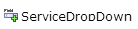
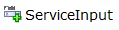
This allows a services drop-down list to be displayed and selected. |
|
|
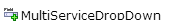
This allows more than one service to be selected and displayed. |
|
|
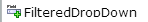
This was in use before the ServiceDropDown as a way to filter input of one drop-down field from another field. |
|
|
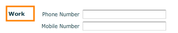
This allows a field with prompt (its own label) to be placed on the screen. |
|
|
This is used as a horizontal place-holder for labels, fields, cells, and Bindings and is limited to one row in a screen. One method for building depth into a screen is to use multiple rows. Use this component to lay out rows and columns on a screen. |
|
|
This is a place holder for rows. Use a row set in preference to a table when you want to show labels and line up the fields evenly on the page. The number of columns depends on the number of items in each row. |
|
|
This is a place holder for rows. Use a table in preference to a row set if you want to line up the fields directly next to each other without showing any labels. Use this component to set fields in a tabular layout. For example:
|
|
|
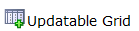
This is a place-holder for updatable grids. Use this item to create tabs. |
|
|
This is a place-holder for tabs. Use this item to create tab sets. |
|
|
This is a place-holder for columns that have a heading label and are populated with rows of data as a result of entry or retrieval actions. |
|
|
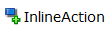
If hidden, the InlineAction triggers a service call when the request pairing fields change, and populates the reply pairing fields. If it is not hidden, then it appears as a button that needs to manually be pushed. |
|
|
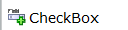
Provides a check box and associated properties, including a label and attribute. |
|
|
Provides a date field with calendar display / selection. |
|
|
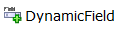
Provides an input field that stores information according to the properties settings. |
|
|
Provides the ability to browse for a file and stores it according to the properties settings. |
|
|
Provides the ability to input a numeric value according to the properties settings, which can restrict the value range (minimum/maximum) and provide an initial value. |
|
|
Provides the ability to input a time value according to the properties settings, which can provide an initial value. |
|
|
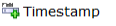
Provides the ability to input a date/time value according to the properties settings, which can provide an initial value. |
|
|
Provides the ability to dynamically select/define the type of field for a cell within a row. This allows different rows within a table to hold different value types. |
|
|
Allows an attribute to be added to a search result grid column. |

Additionally, the following components relate to updatable grids:
|
Columns |
There is one columns place-holder for each updatable grid. Fields from the service attributes can be selected to populate the column. Provides the ability to dynamically select/define the type of field for a cell within a row. This allows different rows within a table to hold different value types. |
|
Field Pairings |
Sits under an updatable grid along with the columns. Field pairings are used to specify the fields from the page that are sent to the server during a service call. There is one field pairings layout for each updatable grid. |
Service Attributes
Service attributes, by service and operation pairing, available for adding as fields to the screen display in the Service Attributes tab of the right-hand is panel.
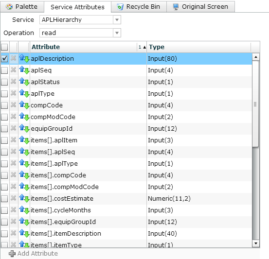
The components of service attribute include:
|
Service |
The service provided in CCLAS that relates to the application to be personalised. |
|
Operation |
The operations that the service provides, for example, retrieve, fetch, approve, delete, create, search, read, confirm, and so on. |
|
|
Use the top check box to select all attributes. Use the check box against a row to select that attribute. Multiple attributes can be selected. |
|
Attribute |
The fields associated with the service and operation pairing. Attributes have associated properties. |
|
Type |
The attribute type. For example, it might be a text or numeric field that has a limited character length. If the number enclosed within brackets states 20, then a maximum of 20 characters may be entered for the attribute. The attribute type could also be a date field, or a flag field. |
|
|
This icon indicates that the field attribute returns data from the server. The presence of the down-arrow depends on which Operation is selected. |
|
|
This icon indicates that the field attribute passes data to the server. The presence of the down-arrow depends on which Operation is selected. |
|
|
This icon indicates that the field attribute passes and returns data to and from the server. The presence of the down-arrow depends on which Operation is selected. |
|
|
Click this button to add a new field attribute to a service. The Add Attribute dialog box displays. You need to give the new field attribute a name, a type as defined in the MSECAT—Custom Attribute Types application (such as a string, date, or integer), and whether it can have multiple values. |
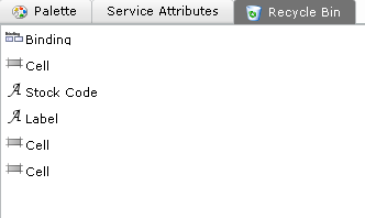
Recycle Bin
Components (fields) which are deleted from the Screen Layout panel display in the Recycle Bin tab of the right-hand panel. These components are available for adding back to the screen, if required, saving time for relocating them in the Service Attribute tab.
Original Screen
The screen layout of the original screen, that details the original screen's components in a tree structure, displays in the Original Screen section of the right-hand panel.
Properties
When a component in the Screen Layout panel is selected, then the properties of the component display in the Properties section of the right-hand panel.
The properties that display in the panel vary according to:
- The field selected
- The property types that are set up for the field
- Whether the screen is a search or detail screen.
Note: Only fields have properties.
The example below displays the properties for the Stock Code input field:
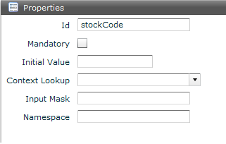
The following properties display for a field:
|
Label |
The label of the field, field group or tab. |
|
Id |
Id of the field within the DTO. Only applicable for a core attribute, that is, where the attribute is a service attribute and not a custom attribute. |
|
Attribute |
Name of the attribute. Only applicable for a custom attribute. |
|
Mandatory |
Select this check box to switch the field to mandatory or optional when performing a search or creating/updating a record. |
|
Hidden |
Select this check box to hide the field. |
|
Initial Value |
The default display of information in a field can be from either: An initial value provided as part of personalisation The default from a service call (this overrules the personalised initial value if entered). |
|
Disable on Update |
Disable the selected field when the screen is in update mode. |
|
Disable on Create |
Disable the selected field when the screen is in create mode. |
|
Context Lookup |
|
|
Force Context Lookup |
|
|
Input Mask |
Input mask. |
|
Length |
Length of input. |
|
Namespace |
|
|
Maximum Width |
Width of field display. |
|
Length |
Length of character string stored in the field. |
|
Case |
Case required for the field. Only applicable for a custom attribute. This can be:
|
Adding a Component to a Screen
Various components can be added to a screen using drag-and-drop from the Palette panel into the screen representation contained in the Screen Layout panel.
Note: Components in the Recycle Bin can also be used, if available.
Drag-and-drop roles for components:
-
Particular components can only be dragged into certain areas of the screen. The following table lists the types of component and their valid drag targets.
Page component Valid drag targets Field
Row, Binding
Row
RowSet
RowSet
Form, Tab, Row
Tab
TabSet
TabSet
Form, Tab, Row
DataGrid
Form, Tab, Row
Label
Form, Tab, Row
Binding
Row
Action
Actions
Dialog
Dialogs
FieldGroup
Form, Tab, Row
Cell
Row
Table
Form, Tab, Row
Sometimes, the requirement is to remove an item or component from a screen.
Note: All items or components that display  Delete can be deleted.
The following items cannot be deleted:
- Form
- Dialogs (Dialog Boxes)
- Actions.
Delete screen items or components from a screen
The position of a component can be moved on a screen, allowing components to be displayed in a desired order.
Some types of components can be moved whilst others cannot be moved.
- The following components can be moved: Fields, Field Groups, Tabs.
- The following components cannot be moved: Forms, Dialog Boxes, Actions.
Refer to the drag-and-drop rules for more information on the types of components that can be moved.
Columns within a grid cannot be moved as part of personalisation. Grid settings are used for this purpose. For more information, refer to Grids.
Note: If a  Grid row delete grey icon displays beside the item in the Screen Layout panel, then this item cannot be moved or deleted.
Move the position of a component on a screen
Adding Service Attributes to Screens
Service attributes, core or custom, can be added to, or removed from, a screen.
Service attributes, core or custom, are populated when the screen is in use if the service is associated with the screen.
Note: Only fields that are correctly defined as attributes in the MSEATT—Service Custom Attributes application can be added to the field group.
Add a service attribute to a screen
Remove a service attribute from a screen
Adding Custom Service Attributes to Screens
Whilst service custom attributes can be maintained using the MSEATT—Service Custom Attributes application (refer to the Configuring Custom Attributes), the Screen Personalisation tool also has the ability to create service custom attributes by launching the MSECAT—Custom Attribute Types application directly from the personalisation environment. This process internally links the CA, the CAT, and the DTO entity.
The benefit of using screen personalisation over the MSEATT—Service Custom Attributes application is that you can see which service is supported by the user interface, the list of core attributes that are available for that service, and the list of custom attributes that are available for that service. However, the MSEATT—Service Custom Attributes application does allow for custom attributes to be imported.
Once the target Service is selected, service custom attributes can be added.
A service custom attribute has an Attribute Name, links to an Attribute Type which is either a core or custom attribute type, and is flagged for Multiplicity which means that the custom attribute can store more than one value, so it should be rendered as a multi-value field on a screen.
Once a custom attribute is added to a service, it is treated the same as a core attribute on any object created by the service, as though it was read from the default table associated with the service.
Note: It is only when a user is given permission to use a custom attribute that the user can 'see' and 'use' the custom attribute. When a custom attribute is created, it needs to be added to a right to which the whole laboratory (in most cases) has access. This effectively means that all custom attributes created for an environment should be assigned to a custom right, that custom right to a custom security role, and that custom security role assigned to any user who wishes to 'see' and 'use' the custom attribute (refer to maintaining security roles when Maintaining Users).
Add a custom attribute to a service and screen
Changing the Properties of a Field
For any field item, it is possible to:
- Update the Label for the field.
- Mark the field as Mandatory.
- Flag the field as Hidden.
- Specify the Initial Value (default) for the field
- Flag the field as Disable on Create to disable the field on a create screen.
- Flag the field as Disable on Update to disable the field on an update screen.
Warning: Where a field that holds a primary key, if it is made read-write instead of read-only and a user subsequently updates the content of the field, then any issues rising from broken links to the record are not the responsibility of Datamine.
Update properties for a field item
Grouping Fields on a Screen
Binding is a user interface grouping mechanism. It gives the ability to put multiple input fields in one layout group on a form using the Field Group and Binding controls.
The label for the layout group on the user interface is taken from the first input field. The labels from the subsequent input fields of the layout group are ignored.
Each field in the layout group is laid on the form, one after the other, with minimal space between each, and with no new line. Where there are too many input fields in the layout group to fit on one line, the line is wrapped to the next line on the form (this does not the same as a new line in the same way that a field group always starts on a new line).
Manage input fields in a layout group (binding)
Modelling UI Behaviour
There are two ways to model UI behaviour on the form before submit:
- Client-side behaviour via scripts bound to the form.
- Modelled behaviour based on properties of an attribute, with a hide/show button based on the attribute's selected value, typically hidden but can be shown.
Applying Conditional Formatting to a Grid
Conditional formatting is applied to a grid to highlight cells within a row based upon a pre-defined condition.
Conditional formatting can only be applied to read-only grids, which includes:
- A search grid; or
- A grid that has no create or update operation associated with it.
One or more expressions can be configured to apply formatting to a grid column. These expressions can comprise sub-expressions where each sub-expression is used to test column's data. One or more column names can be used in the condition to then affect another column on the same grid.
When the grid data is populated, for any rows in the grid where the column's data matches the expressions, then the row's background is highlighted and the cells are flagged.
The auto-saving of grid preferences saves what (if any) formatting is applied to each column and whether the formatting options is visible in the grid’s header. That is, if the application were to be closed and re-opened, all formatting preferences are restored. The same applies to saved searches.
Columns include custom attributes and columns that are created dynamically using script.
When adding a sub-expression for a date/timestamp-based column, the date value can be a static date or a dynamic date based upon various starting points, plus or minus a specified period of time.
If all sub-expressions are deleted from the expression, the expression is deleted.
Expressions are applied from top to bottom, so the sequence of expressions is important. If there are multiple matching expressions, the last matching expression is applied to the cell. Expressions can be re-ordered, if required.
Apply conditional formatting to a grid
Examples
 Example—Add a Delta DateRange Dropdown to search forms
Example—Show the Include Cancelled Jobs criteria in CCWKBK Search
Exporting Screens for Customisation
Important: Customised applications are not supported by Datamine.
Although CCLAS screens can be personalised using this process, the personalisation tool has limitations. For this reason, screen definitions can be exported from the personalisation tool as an XML file, modified and imported into CCLAS 6 as a customised screen definition using the CCCSD—Custom Screen Definitions application. Refer to Maintaining Customised and Personalised Screens.
Customised application screens can also be developed externally and imported as a customised screen definition.
When importing customised applications, the xml must be imported as a zip file. Multiple xml files can be included in the one zip file.
Export a screen definition from the personalisation tool
The personalisation tool is not available for a custom application.
Refer to Customising Screens.
Note: Customisation requires xml developer skills.
 Related processes...